krh
kyra
[insert bombastic
catchphrase here]
i do UI/UX Design
event management platform
recent work | mereka.io
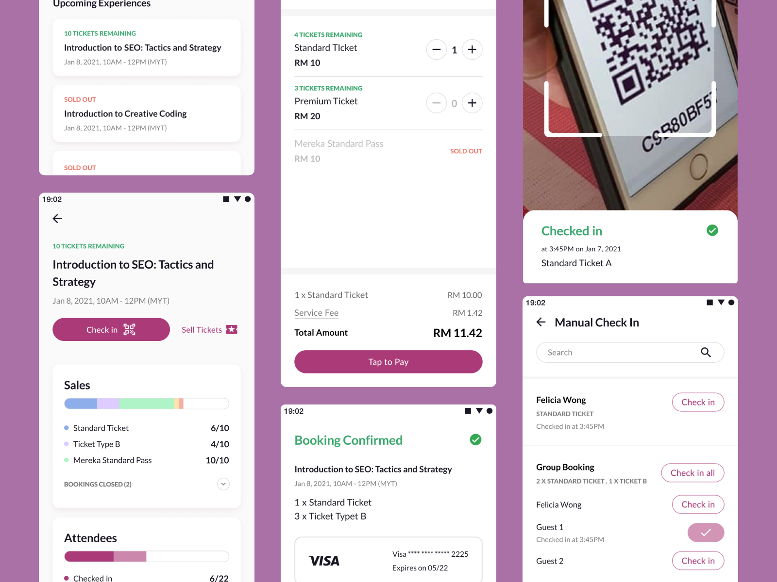
Mereka is a platform catering to creative and educational businesses, allowing them to list their events and workshops to make them available for bookings and visible to the public. For 2 years, I mainly worked on the business-facing dashboard and tools allowingusers to manage their listings effectively.
furniture procurement system
case study | the makeover guys
a case study on vendor tracking, stock management, and an internal marketplace all in one, in order to speed up the workflow of an interior design agency
hiring dashboard
case study
design for a recruiter to manage and schedule interviews with job candidates at a large scale
sustainability company website & brand identity
web design | biji-biji initiative
BBI is a Malaysian environmental-based social enterprise with services ranging from custom-making upcycled merchandise to organising sustainability workshops and programs. this website mainly aims to convey the business' offerings to potential corporate clients or collaborators.
sometimes i write, but not often
The UX of design handoff
2024 | blog post
Handing finished designs over to product and development has got to be the most enigmatic part of the UX process. Figma files tend to be a bit of a mess, and I’m always hunting for ways to keep it clean, clear, and light. I will say part of the mess is my own doing, but there has to be a way to make things make sense for everybody?
Bondee: The Social Metaverse We Actually Like
2023 | article for Kreatif Beats
Whether Bondee and the minimal form of metaverse it represents is here to stay, or simply a transitional phase before we all are virtually surfing with the Zuck himself, I do see a few things we can learn from this in the cultivation of new digital spaces. The metaverse is definitely a concept that is starting to have roots, I wonder if it will really grow or fizzle out of the mainstream eye ?
the conflict and catharsis in deleting old accounts
2021 | blog post
Social media became a sort of archive of my youth: the online identities I cultivated through these many different @’s is something reflective of the adolescent end-all question that is “who am i?”
my work at mereka.io
Mereka is an education & technology startup with numerous lines of business, one of which being an event platform where small enterprises and entrepreneurs can list their workshops, events, and services, and the average consumer can search for, view, and book these listings. I started my career at Mereka as an intern in late2022, then became a full-time designer a few months after. In the two-ish years I've been here, I've had the opportunity to improve existing designs, create new features from the ground up, and learn the busy, chaotic ways of a small tech company (and tried to optimise the chaos a little bit along the way- more on that later, keep reading!) my journey was full of ups, downs, and maybe a couple spirals in either direction? nonetheless, i've grown more than i could have ever expected from a first job - you get to do a lot when your team consists of only three designers.here are some of my greatest hits - a mix of projects that had impact, and some personal favourites too.
schedule meetings with experts!
while the platforms MVP is event booking, we also aimed to make room for solopreneurs, teachers, and mentors (overall labelled as Experts) to make use of our booking features - to do so, I designed a scheduling feature, where users can request a certain meeting time that can then be accepted or rejected by the expert
ticketing app for sales on the go
in 2023, some of the most popular features we were being requested to introduce were:1. on-ground sales, without attendees having to go through the lengthy process of opening mereka.io > finding the event they were already physically at the door for > choosing tickets > signing up > booking, finally.2. efficient methods to check in attendees who have tickets, be it by manually checking off a list on-platform, or by giving them QR code tickets similar to cinemas or airlines.
both of these requests were not easy to accomplish on a browser-based platform. 1 would need some sort of cashier system and a credit card scanner to be effective, and 2. would require camera access on the event staff's device. thus, the companion app to our existing web platform was born!
this was particularly fun as I enjoy designing for mobile, and also had more creative liberty since this was not entirely locked in to our existing design system
check this out, it's a checkout page
paying sounds like the simplest part of a user flow, but it turned out to be quite a challenge and lesson in balancing back-end requirements with front-end simplicity. in an older iteration of this page, emails needed to be collected, users had to log in to proceed but none ever did, a users were skipping back and forth between sections and therefore missing out required fields, or accidentally resetting other already filled ones.with that, i introduced a progress stepper up to, and used some nifty accordion sections to prevent users from trying to escape filling in their email and scrolling straight to the payment form.
home is where the heart is, and my heart lies with FigJam
aka. proof that i go through the UX research process, when time permits - i am more than just a Dribbble shill
furniture procurement system
case study
"What if obtaining inventory from our vendors could be as easy as online shopping?”
I took on a three month internship at a local interior design startup, within their Digital Transformation department that focuses on discovering digital solutions to improve the company workflow. The company has a unique mode of operation where they templatise home makeovers to ensure a speedy process and mainly caters to property owners aiming to rent out their apartments/houses.The team initially searched for off-the-shelf solutions to improve the process of ordering furniture from vendors (which typically consists of the designers going back-and-forth on Excel sheets and WhatsApp with the individual vendors) as the operations team was struggling to continue with the existing flow especially as the company is growing and taking on more projects.However, we held a design sprint with members of both operations and digital transformation team, and realised that the needs and workflow of the company are too complex for generalised, mass-market solutions, and it was then decided that the best way moving forward would be to tailor-make a solution that fits all those needs.
The operations team suggested a process similar to buying things on typical e-commerce platforms, but with added functionality that suits them such as segmenting orders into different rooms within a unit, and the option to reserve an item before receiving confirmation from clients.This is designed for desktop so that the designers can easily see everything on one page, and also go back and forth between other files they may have open while ordering such as cost estimation documents. All usable inventory be it stored with the company warehouse or with the vendors will be viewable in a marketplace format, and can be ordered for the individual client projects based on pre-set lists of items needed.
The issue being tackled is not as simple as providing a solution to the internal team, but also required an accompanying platform for the vendors where the inventory was being ordered from to completely streamline the process. We decided to design this for mobile instead of for desktop, keeping in mind that vendors may need to process orders and requests on the go and potentially while they are in warehouses or storage locations.For some vendors, the company would make agreements for them to set aside a set number of inventory, but this is typically just a verbal agreement. So, we added these stock commitments into the app to have a more concrete view of what has been reserved.
Last but not least, the bridge to connect the marketplace, vendor app, and a third party stock count tool. This platform is intended for the procurement team to be able to manage the stock commitments with each vendor and place orders for more, view stock numbers for inventory, and create the user accounts in order for vendors to access the vendor app in the first place.
hiring dashboard
case study
Prompt: As a recruiter, I need to have an application that allows me to efficiently manage candidates at a large scale. Communication is my largest pain point and I need to be able to communicate to candidates effectively to schedule interviews and other related discussions. email templates. As part of a growing company, I have a couple of team members under myself and they need to be able to partake in the process I am in such as scheduling calls, finding the right candidate, and other related tasks.
my process
1. jot down what pages or solutions i’d design - if i have more time I would normally do a user flow diagram or flowchart after this step, but this was a 1-day design challenge.2. reseach and inspiration ; I looked at other job board sites to learn about the information needed, but also looked at a few CRM platforms as I feel as if the information would be displayed in similar manners3. design : this was meant to be a low-fidelity mockup, but I like to add colours & shape (corner roundings, simple icons that can be done with pen tool) to help visualise the information hierarchy more accurately than doing it with just text and grey boxesIt is assumed that there is a separate, candidate-facing platform where people can apply for jobs - this is not part of the design prompt, but there may be contextual gaps that could only be addressed by having that designed
From the dashboard page I designed, recruiters would be able to view all applicants at a glance, then click on a name from the list to view the applicant profile and resume, then either assign the applicant to another recruiter, or screen the applicant immediately.Applicants can be selected for interview or rejected via the buttons displayed beneath the profile - the Schedule Interview opens up a second drawer where the recruiter can select date and time slot options for the interview session that the applicant can choose from. Here, a templatised invitation email is also displayed and can be edited if needed, while not necessary. Then, the recruiter can click the Send Invitation button for the email containing the invitation and slot selection to the applicant.I chose to use sidebar drawers for each step as a recruiter might be reviewing many applicants in a single sitting, and would need speed and efficiency to go through all of the steps above - putting these into a popup or a separate page might be perceived as a lot more back-and-forth.
I sort of took a chicken-before-egg approach to this project unintentionally, and only worked on the flow of creating job listings for people to apply to after working on the dashboard of applicants. I broke this up into a few pages:
1. An overview of existing job listings
2. The form for users to create new job listings
3. An expanded view of a job listing , where the user can see all the input they added in 2., and also a filtered view of profiles of those who applied to this job in particularUnlike the dashboard page, this flow is something that a recruiter may not need to access as frequently nor do the steps necessitate speed and efficiency as screening candidates would. So, I broke this up into pages for each task and context. 1 being an overview, 2 being a form that may require time and scrutiny over the input details in order to convey clarity to those who wish to apply, and 3 serving as a more focused version of the hiring dashboard.